
Customizable selects change the system decision, not the accessibility work
Modern browsers can now style parts of a native select that used to force teams into custom widgets. Mintec's decision framework keeps the native control as the default, uses progressive enhancement deliberately, and reserves custom components for behavior the platform cannot provide.
Customizable selects change the system decision, not the accessibility work
A design system should keep the native <select> as its default choice for a one-of-many form field. New customizable-select features are useful because they let teams improve its visual fit without rebuilding its keyboard, form, and accessibility behavior from scratch. They do not make a custom dropdown safe by default.
The humble select is where product teams often lose discipline. A visual mockup asks for an avatar, plan icon, colored status, or an inline price inside a field. Someone decides the browser control is too plain. A library dropdown arrives. Weeks later, the team owns open-state logic, focus trapping, escape behavior, pointer input, scrolling, type-ahead, validation, and form serialization for a control that browsers had already solved.
We use a sharper rule at Mintec: first decide whether the browser's selection behavior fits the job. Only then decide how much of the native control needs styling. That separates a legitimate product requirement from a design-system preference disguised as one.
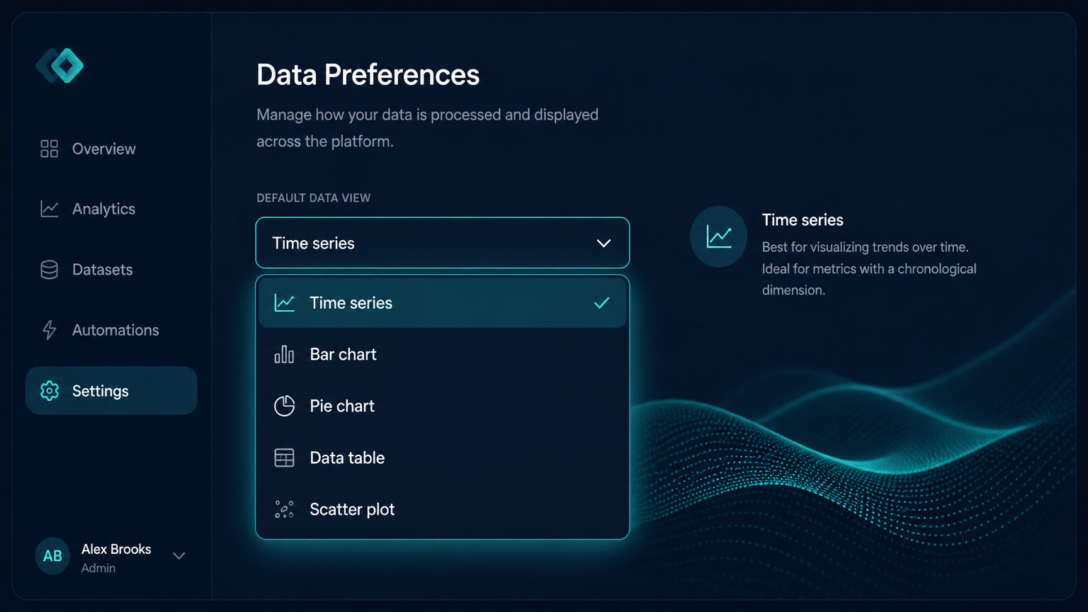
The timing matters. MDN describes customizable selects as experimental and warns that the HTML and CSS involved have limited browser support.[1] Chrome's implementation shows the point of the feature: appearance: base-select moves a native select into a configurable styling mode, while unsupported engines can still render the ordinary control.[2] That is a good foundation for progressive enhancement, not permission to ship an untested widget.
The cost of replacing a control is larger than its CSS
A custom dropdown tends to look fine in the happy-path demo because the demo starts with a mouse, a short list, a perfect viewport, and no validation error. Production has less polite conditions. People use keyboards. They zoom. They select a country from a long list. They tab back to correct a field. They use a screen reader. They submit the form with an invalid value.
A native select has answers for those cases before a product team writes a line of JavaScript. Its value belongs to the form. Its label is exposed. Its options have established keyboard behavior. The browser participates in the interaction instead of becoming an empty shell around a styled div.
That does not mean every select must look like browser chrome from 2008. The appearance property exists to control how native UI is presented, and the newer base-select mode expands what can be styled in supporting browsers.[2][3] It does mean visual ambition must not quietly turn into a rewrite of platform behavior.
The same native-first instinct is why Declarative Shadow DOM matters: deliver useful structure before adding client code.
Use the three-door decision before you design the field
A select should pass through three decisions. The order matters because the more custom code a team writes, the more behavior it owns for the life of the system.
| Door | Use it when | What the system owns | What to reject |
|---|---|---|---|
| Native select | The field chooses one value from a known list and needs no rich interaction | Label, value, validation, keyboard behavior, submission | Rebuilding it because the arrow is unattractive |
| Progressively enhanced select | The same normal selection needs stronger visual hierarchy in browsers that support it | Native behavior plus optional visual layers | Making the enhanced markup the only functional path |
| Custom component | The field is not actually a select: it searches remote results, picks many values, creates values, or contains actions | Every interaction, accessibility contract, form integration, and fallback | Calling an autocomplete, command palette, or menu a "styled select" |
The first door should cover more cases than teams expect: country, company size, service package, office location, budget range, and a known list of language options. A colored option or a compact icon is not enough reason to move to the third door.
The second door is where the new browser capability is interesting. It lets a design system express visual information that would otherwise tempt a team into a fake select. A plan picker can show an icon; a locale selector can show a language mark; an internal workflow can display a status swatch. The underlying field remains a select when the browser does not understand the enhancement.
The third door is valid, but it is a different component. Searchable customer records, asynchronous inventory, multi-selection with removable chips, and command-like actions require richer behavior. Treating that interface as a select is the first mistake. Name it accurately, choose the right ARIA pattern where needed, and budget the testing work before promising the design.
Build an enhancement that can disappear safely
The fallback is the product. The custom appearance is an addition.
Start with valid, useful HTML. Give the select a visible label, a name for form submission, real option text, and a value that works without any extra styles. Then gate the enhancement with feature detection. The illustrative CSS below scopes the base appearance to browsers that understand it:
.plan-select {
  inline-size: 100%;
  min-block-size: 2.75rem;
  font: inherit;
}

@supports (appearance: base-select) {
  .plan-select,
  .plan-select::picker(select) {
    appearance: base-select;
  }

  .plan-select::picker(select) {
    border: 1px solid var(--color-border);
    border-radius: 0.75rem;
    box-shadow: 0 0.75rem 2rem rgb(0 0 0 / 0.14);
  }
}
The API will evolve, so the contract cannot be "the picker looks identical everywhere." It is "the field works everywhere; supported browsers receive extra detail." Chrome's documentation shows that an unsupported browser can omit richer option content and still render the select normally.[2] If a cue is essential, put it in text as well. Color or an icon cannot carry the meaning alone.
Keep the selection label boring and the option content honest
The enhanced syntax allows richer internal structure, including a select button and selectedcontent. That can be useful, but it invites the same bad instinct that made teams invent dropdowns in the first place: putting a miniature interface inside a form field.
We set two boundaries in design reviews.
First, the closed control needs a plain-language selected label. A service tier can have an icon, but "Growth plan, $1,200 per month" still needs text if that icon disappears or is not announced. In a bilingual site, label length is a component constraint, not a screenshot decision.
Second, options select values. They are not a place for secondary buttons, links, or sales copy. MDN notes that the select button is inert by default, so interactive children inside it are treated as part of one button rather than independently focusable controls.[1] Put a "compare plans" link next to the field, not inside an option. Put an explanation below the field, not inside the picker. The control becomes easier to understand and easier to test.
This aligns with the discipline behind our WCAG 3.0 preparation guidance: a component is not accessible merely because it passes in isolation. Its label, state, error message, and surrounding instructions have to work together in the form where people encounter it.
Treat the component as content-bearing infrastructure
Most design systems model a select as a few colors, radii, and an arrow. That model breaks when the business asks for locale names, plan prices, inventory state, or translated descriptions. The field has content rules, not only CSS rules.
For each select variant, document these decisions beside the component:
- The maximum visible label length in each supported language.
- The text alternative for any visual mark.
- Whether price, availability, or status belongs in the option text.
- The empty state and error wording.
- Whether the list can ever become long enough to need search. If yes, the component may be the wrong primitive.
This is where a bilingual content model and frontend architecture meet. We made the broader case in our article on multilingual Astro and Next.js architecture: translation is not a string replacement after the interface is done. It changes constraints at the component level.
Make the fallback part of acceptance testing
The review needs a short matrix, owned by both design and engineering.
| Test | Expected result | Failure that should block release |
|---|---|---|
| Keyboard | Tab reaches the field; arrows or standard keys change the option; Escape behaves predictably | Focus is lost, trapped, or requires a mouse |
| Form | The selected value submits and a required error identifies the field | A visual value differs from the submitted value |
| Assistive tech | The label, selected value, requirement, and error have useful names | The field announces as an unlabeled generic control |
| Unsupported browser | Standard select remains usable and text carries the choice | The form shows an empty, broken, or unselectable shell |
| Zoom and translation | Long labels and errors remain visible at 200% and in every locale | Text is clipped or meaning depends on an icon alone |
The unsupported-browser row reveals whether the feature is an enhancement or a dependency. If the ordinary select is acceptable, a limited-support API is low risk. If it breaks the form, visual parity has displaced product quality.
A better default for design systems
Customizable-select APIs let teams explore richer native styling without importing a dropdown library. The durable rules stay the same: use native controls for native jobs, keep essential information textual, test browser support, and build custom interaction only when the product needs it.
Sources
[1] https://developer.mozilla.org/en-US/docs/Learn_web_development/Extensions/Forms/Customizable_select — MDN: Customizable select elements [2] https://developer.chrome.com/blog/a-customizable-select — Chrome for Developers: A customizable select [3] https://developer.mozilla.org/en-US/docs/Web/CSS/Reference/Properties/appearance — MDN: appearance
Frequently Asked Questions
What is a customizable select?
A customizable select uses emerging HTML and CSS features such as appearance: base-select and ::picker(select) to style parts of a native select while retaining the browser's form semantics. Browser support is still limited, so it needs a standard-select fallback.
Should a design system replace native selects with a custom dropdown?
Only when product behavior cannot be expressed with a native select. A normal single-choice field should remain native; visual embellishment can be layered on as progressive enhancement.
How should teams test a customizable select?
Test keyboard selection, screen-reader naming, form submission, zoom, error states, and the unsupported-browser fallback before approving its visual treatment.