Web Design & UX Trends: What Users Actually Expect from Modern Websites
Users decide whether a site is trustworthy in under 0.05 seconds. 88% never return after a bad experience. Here are the real web design trends in 2026 — performance, accessibility, micro-interactions, and UX patterns — backed by data from NN/g, Google, and WebAIM.
Web Design & UX Trends: What Users Actually Expect from Modern Websites
One thing became clear after going through this year's usability data: web design is no longer about how a site looks. It is about how it feels to use. And users are increasingly unforgiving of mediocre experiences.
A Google data point worth remembering: 53% of mobile users abandon a site that takes longer than 3 seconds to load. But the problem is not just speed. It is expectations. Users in 2026 have used native apps, conversational AI interfaces, and personalized experiences everywhere. When they land on a corporate website and find slowness, confusing navigation, or layouts that do not fit their screen, they leave.
There is no second chance for a first digital impression.
Performance: the foundation of everything
We can talk about micro-interactions, variable fonts, and CSS animations all day. If the site loads slowly, none of it matters.
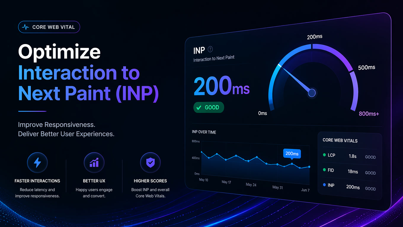
Google Core Web Vitals have been a ranking factor since 2021, and the standards have only tightened since then. In 2026, current thresholds are: LCP under 2.5 seconds, INP under 200ms, CLS under 0.1. Beyond SEO, performance directly impacts conversion. The State of CSS 2026 confirms that high-performing sites see up to 2.5x higher conversion rates. Not theory. Actual money.
What I see working in 2026:
- AVIF and WebP images with lazy loading and explicit dimensions to prevent CLS.
- Minimal JavaScript. The framework matters less than not shipping 500KB of unused JS on first load. Partial hydration, islands architecture, server components — all solve this differently.
- Critical resource preloading. Fonts, critical CSS, and hero images with
<link rel="preload">orfetchpriority="high". - CDN with edge caching. For global audiences, a well-configured CDN cuts latency from 300ms to under 50ms.
If your site loads in under 1.5 seconds on mobile 4G, you are in the top tier. If it takes more than 3 seconds, you are losing customers.
Accessibility: from optional to mandatory
Web accessibility went from "nice to have" to a legal and business requirement. Lawsuits over inaccessible websites increased 300% between 2022 and 2026, according to WebAIM. The EU, US, and several LATAM countries are tightening regulations.
Beyond the legal side: WebAIM's 2026 report found that 96.8% of top homepages have detectable accessibility errors. That is almost every site. And those errors do not only affect the 15% of the population with a disability. They affect everyone using a site under adverse conditions — sun on the screen, one hand busy, slow connection.
What well-designed sites are doing in 2026:
Sufficient contrast. WCAG 2.2 requires a 4.5:1 ratio for normal text and 3:1 for large text. Tools like Stark and axe DevTools automate checks during development.
Full keyboard navigation. Every interactive element must be accessible with Tab, Enter, and arrow keys. Basic stuff, but most sites get it wrong — especially dropdowns, modals, and sliders.
Descriptive alt text. Not "office-image-123.jpg." "Design team collaborating at a table with monitors and a whiteboard."
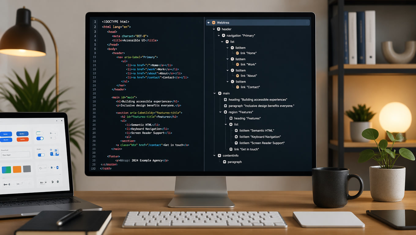
Screen reader support. Use semantic HTML5 landmarks (<nav>, <main>, <aside>, <footer>), ARIA roles where needed (and only where needed), and visible focus states.
Reduced motion mode. Use prefers-reduced-motion to respect user preferences. Not everyone wants animations.
Accessibility is not a feature. It is how you build the site from the start.
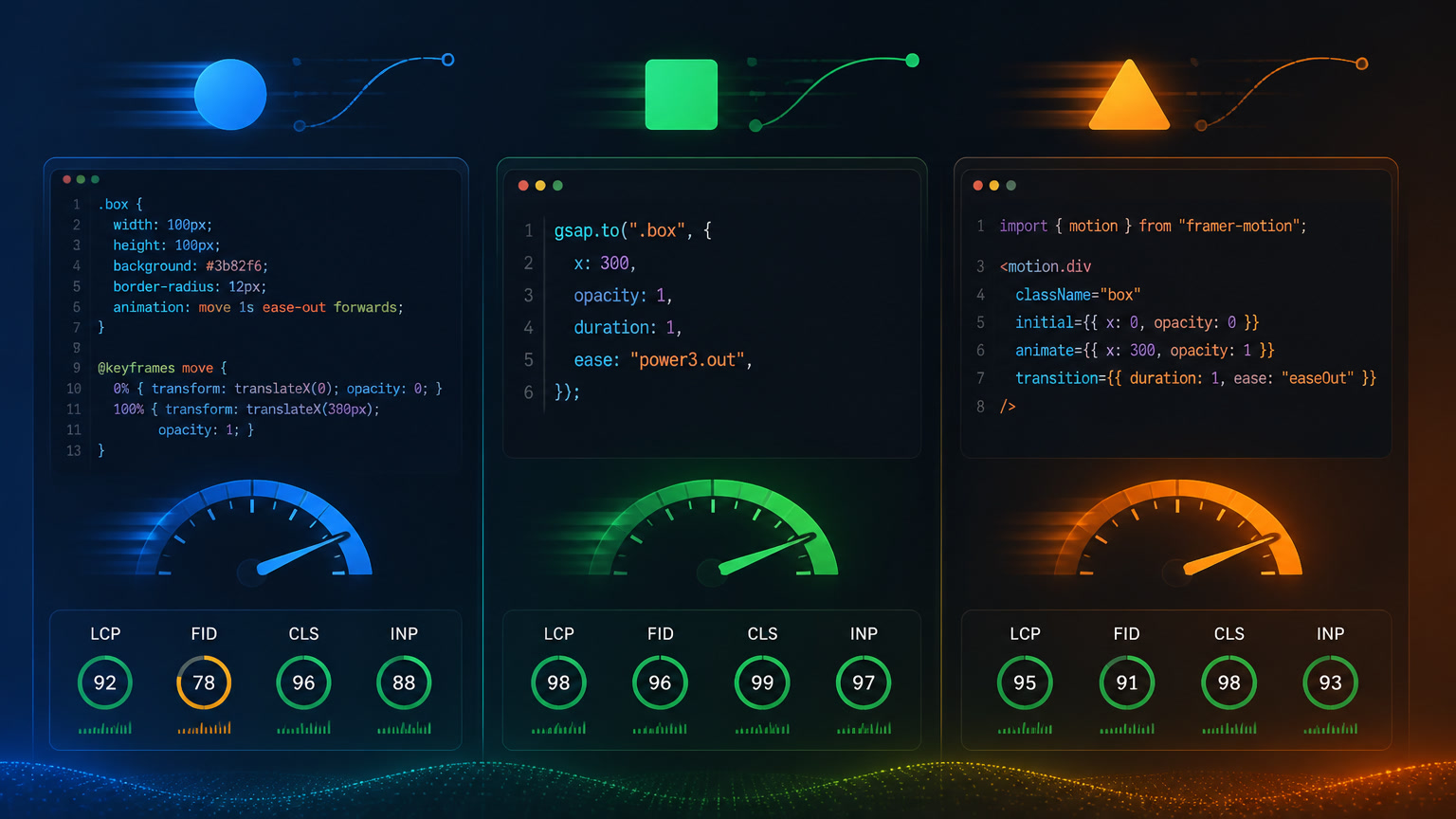
Micro-interactions: the details that make a difference
Users do not remember layouts. They remember how it felt to interact with the site. Micro-interactions are those small feedback moments — the button that changes color on click, the card that lifts slightly on hover, the animation confirming a form was submitted.
NN/g research confirms it: well-designed micro-interactions increase perceived quality and trustworthiness. But they also warn: done poorly, they distract and frustrate.
What works:
- Immediate feedback. Every user action needs a visual response in under 100ms. A click with no response feels like an error.
- Purposeful animation. Do not decorate with animation. Use it to explain: a card expanding to show content, an element sliding to indicate completion, a loader that entertains while content loads.
- Smooth transitions. Page or state changes should be neither instant nor slow. 200-300ms is the sweet spot for most transitions.
- Honest loading states. Not generic "loading..." A skeleton screen showing the structure of incoming content.
The mistake I see most often: animations that prioritize aesthetics over function. A beautiful animation that makes the user wait is worse than no animation.
Navigation patterns that work in 2026
Navigation is where most websites fail. Users arrive, do not find what they need in 5 seconds, and leave.
Patterns working this year:
Sticky but smart navigation. The menu hides on scroll down and reappears on scroll up. More space for content without sacrificing access.
Prominent search. Do not hide search behind a magnifying glass icon. On sites with more than 10 pages, search should be visible and work well — autocomplete, real-time results, typo tolerance.
Mega menus with clear categories. For sites with many sections, a well-organized mega menu (columns, icons, short descriptions) outperforms nested menus.
Breadcrumbs on interior pages. Especially for e-commerce or service sites with deep hierarchies. Breadcrumbs reduce bounce rate and improve navigation.
Complete footer. Not a minimalist footer with three links. The 2026 footer is a secondary sitemap with links to categories, services, blog, contact, and resources.
Responsive design beyond mobile
Saying "responsive design" in 2026 is almost redundant. But the concept evolved. It is no longer about looking good on mobile and desktop. It is about working well in any context: tablet in landscape, foldable phone, smart TV, voice assistant with a screen.
Approaches that work:
Container queries. Components adapt to available space rather than viewport. The same card component looks different in the sidebar versus the main grid.
Fluid typography. CSS clamp() lets text scale smoothly between min and max without breakpoints. font-size: clamp(1rem, 1rem + 0.5vw, 1.5rem).
Responsive images with srcset. Serve exactly the size the device needs — no more, no less. Saves bandwidth and improves speed.
Mobile-first design. Not new, but many still do it backward. Designing for the smallest screen first forces hard decisions that improve the design at every size.
The AI factor in UX design
Worth mentioning how AI is changing interface design. Not replacing designers, but shifting what users expect.
In 2026, users expect a website to understand them. Not to ask everything from scratch. They expect smart autocomplete, semantic search (not just keyword matching), and personalization based on past behavior.
Generative design tools let teams create interface variations in seconds, test hypotheses faster, and personalize experiences by user segment. But human-centered design remains irreplaceable: AI can suggest, but the designer decides.
Bottom line
Web design in 2026 comes down to three things: speed, accessibility, and attention to detail. The frameworks and tools change — the priority of building for the user does not.
If your site needs an update, we have guides on Composable Web Architecture and Core Web Vitals. And if you want to talk about a redesign, our web development team can help build something that actually works.
Related articles
- Core Web Vitals: What Changed and What Still Matters for SEO
- Composable Web Architecture: Headless CMS, SSGs, and the End of Monolithic Sites
- Web Accessibility: Why Your Website Is Costing You Customers (And How to Fix It)